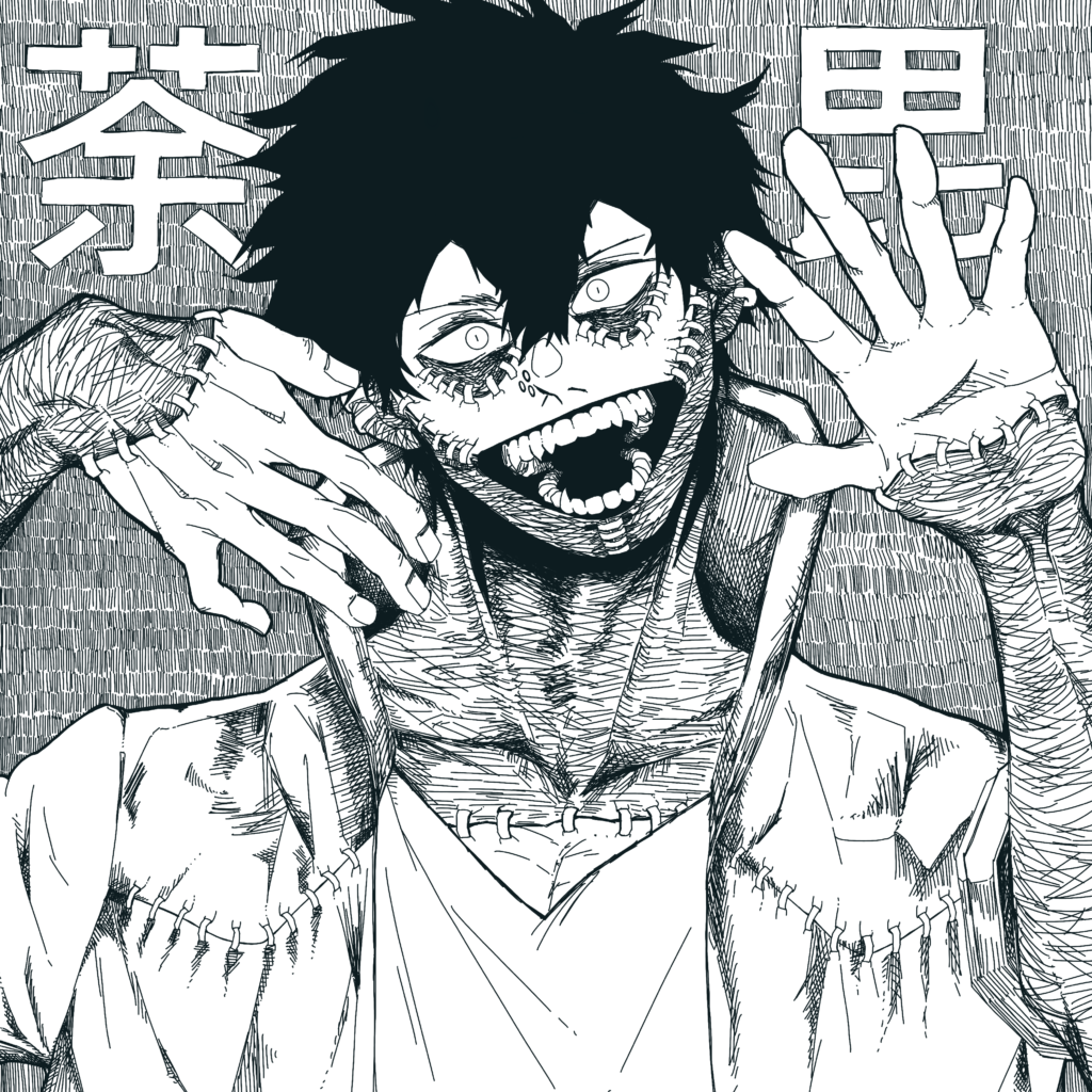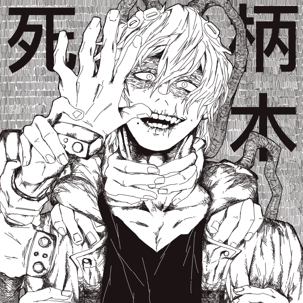

Throwback to when I was so afraid of color theory I rejected all color…
It turned out really good in my opinion.
- The fact that they are villains matches the scratchiness of the ink.
- The hatching also presented the details wonderfully.
- I wasn’t–still isn’t–very good at expression, but I think I nailed their insanity pretty well.
- HANDSS, I don’t know how I managed it, but it’s not horrible. Referencing helps A LOT.
DABI
(First Image)
For Dabi, I used a very dark green-blue instead of black. I find it more interesting to always use an off black (either cooler or warmer shades depending on the piece). Plus it matches his character design and fire.
First, I sketched it out and cropped the canvas accordingly. It started out only as a head but I extended the view. (Good choice).
The teeth are…fun to draw, I like the way it fades to darkness towards the back. His design is just a joy to draw, so much detail and so satisfying.
Hair was originally going to contain highlights, but I abandoned the idea after seeing how good it looks without the highlights. Overall, it just matches the ambiance of the whole piece better.
SHIGARAKI
(Second Image)
In Shigaraki’s case, I used a dark red-brown. It represents his decay quirk very subtly but nicely.
The process was the same to Dabi’s, I sketched it first, although this one had significantly more hands and I had to repeatedly turn on and off layers to make sure they were all in proportion.
His scars and mole were also fun to draw as a cherry on top. Hatching the hands and his costume were as enjoyable as hatching Dabi’s burn scars.
Instead of leaving his hair completely void of any details like I did on Dabi, I added some shadow and flow to it. (Since his hair is overall a light color). It still fit into the rest of the piece well.
I haven’t watched My Hero in so long I don’t even know what’s going on currently anymore, but I still found it fun to draw the characters since Horikoshi-sensei is such a master of design. Especially his villains, they are just *chef’s kiss*.